
VaxNow Health App
 VIEW PRODUCT
 VIEW SOURCE CODE
Overview
VaxNow is a digital health awareness website built to promote the importance of vaccination. It educates users on vaccine safety, immunization records, and timely vaccination schedules, while funneling users toward the core mobile experience: the ImmuniSafe app.
The web product serves a distinct purpose from the mobile app. Where the app is transactional (records, reminders, appointments), the website is informational and persuasive. It had to be fast, credible, and seamless across all devices, the kind of site that someone lands on and actually reads.
My role: Frontend Engineer. I was responsible for translating the designer's Figma handoff into production-ready React code, handling architecture, responsiveness, animation, performance, and deployment.
Project Context
VaxNow sits in the ecosystem of a larger health-tech product, ImmuniSafe, as its public-facing web entry point. The challenge: most people discovering the platform would encounter it through this site first, before ever touching the app.
That meant the website had to do real work. It couldn't be a static brochure. It needed to educate users who might be skeptical of vaccines, communicate trust through clear information hierarchy, and convert visitors to mobile app users, all while running fast on low-bandwidth connections in health-conscious demographics.
The scope when I took over was: a Figma design existed, no codebase existed. Start from scratch, ship something production-ready.
Information Architecture
The site structure was implemented with clear navigation and predictable content grouping. Particular attention was paid to keeping critical information easy to find, especially for users with lower digital literacy.
My Role & Contribution
I owned the entire frontend, from project scaffolding to deployment. The designer owned the visual language; I owned the implementation.
Project Scaffold
Configured Vite + React + TypeScript from scratch. Set up ESLint, testing with Vitest, and Tailwind CSS v4 integration.
Component System
Structured a maintainable component tree, layout, section, and UI-level components with clear separation of concerns.
Animations & Motion
Implemented Framer Motion for scroll-based reveals, hero animations, and the 3D tilt card effect via Atropos.
Responsive Layout
Ensured the layout held across all breakpoints, mobile-first using Tailwind's responsive utilities.
Routing
Set up React Router for page navigation, including handling SPA routing behavior on Vercel deployment.
Deployment
Deployed to Vercel with production build configuration, TypeScript compile step followed by Vite bundle.
Collaboration with the designer was iterative. I would build a section, share a Vercel preview link, and we'd align on spacing, motion behavior, or any details that didn't translate 1:1 from Figma to browser. That cycle repeated until the page felt right.
Engineering Approach
Before touching code, I did two things: I read through the Figma file systematically to identify repeating patterns, and I assessed which sections would need the most custom logic versus pure layout.
The mental model I used was: think in sections, build in components. A landing page like this is essentially a stack of independent sections. Each section is its own rendering concern, its own layout, its own animation, sometimes its own data. That boundary matters for maintainability.
Identify Repeating UI Patterns
Buttons, cards, section headers, badges, these appear across multiple sections. Extract early, compose everywhere.
Classify Sections by Complexity
Hero (complex, animation + layout), Stats (simple, data-driven), FAQ (medium, toggle state), CTA (simple). Tackle complex sections first.
Motion as an Enhancement Layer
Framer Motion was added after layout was stable, not before. Motion bugs are easier to debug when the base layout is solid.
For responsiveness, I used a mobile-first approach: build for small screens first, layer up with Tailwind's md: and lg: breakpoint prefixes. This keeps the CSS specificity clean and avoids the overriding hell that comes from a desktop-first approach.
Frontend Architecture
The project uses a standard Vite + React + TypeScript setup. The src/ directory is organized by concern:
No global state management library was used. This was a deliberate call, the app is primarily presentational with no shared dynamic state between sections. React's built-in useState handles local component state (FAQ accordion toggles, mobile nav open/close). Pulling in Redux or Zustand for this would be overengineering.
React Router v7 handles page navigation. Even though VaxNow is largely a single-page experience, routing was set up to support future expansion, an app download page, a resources page, or an about page could be added without restructuring.
import { Suspense } from "react";
import { createBrowserRouter, RouterProvider } from "react-router-dom";
import { PageLayout } from "./pages/Layouts/PageLayout";
import Loader from "./components/Loader.tsx";
import Lazy from "./utils/Lazy.ts";

// Lazy components
const router = createBrowserRouter([
  {
    path: "/",
    element: <PageLayout />,
    children: [
      {
        path: "",
        element: <Lazy.Home />,
      },
      {
        path: "features",
        element: <Lazy.Features />,
      },
      --*******--
    ],
  },
  {
    path: "*",
    element: <Lazy.Error />,
  },
  --********--
]);

function App() {
  return (
    <>
      <Suspense fallback={<Loader />}>
        <RouterProvider router={router} />
      </Suspense>
    </>
  );
}

export default App;
}
Tailwind CSS v4 was used for styling, integrated natively via the Vite plugin (@tailwindcss/vite). This eliminates the need for a separate PostCSS config and results in faster HMR during development. v4's CSS-first config approach also meant design tokens could be declared directly in index.css using native CSS variables, which plays better with the Framer Motion animation system.
Design → Code Translation
Translating a Figma file faithfully involves more than eyeballing pixels. The job is to understand the intent of the design, the visual hierarchy, the spacing rhythm, the motion behavior, and implement that intent in a way that holds across browsers and screen sizes.
Design Intent
Exact px spacing values defined in Figma frames
Engineering Solution
Mapped to Tailwind spacing scale (py-16, gap-6), with custom tokens for non-standard values
Design Intent
3D tilt card effect on product mockup in hero
Engineering Solution
Used Atropos library, a battle-tested parallax tilt solution, rather than writing raw mouse-event transforms from scratch
Design Intent
Scroll-triggered fade-in animations on section entry
Engineering Solution
Framer Motion's whileInView prop, declarative, performant, and avoids manual IntersectionObserver boilerplate
Design Intent
Custom color palette with brand tones
Engineering Solution
Extended Tailwind's color config with the exact brand hex values to keep class names semantic and consistent
Pixel accuracy is real work. The most common drift points were: font rendering differences between Figma and Chrome, border-radius values that look correct at 1x but feel off at smaller sizes, and shadow values that need to be tuned per background color. I used browser devtools and Figma's inspect panel together to close those gaps.
Challenges & Decisions
Framer Motion Integration
One of the challenges during development was working with Framer Motion for the first time. Beyond just learning the API, the real effort came from experimenting with how animations should behave within the product.
I went through multiple iterations, testing different motion patterns, adjusting transitions, and in some cases over-animating certain sections before pulling things back. This process helped me understand where animation adds clarity and where it becomes noise.
Over time, I refined the usage to be more intentional, focusing on subtle transitions that support the interface rather than distract from it.
Handling Incomplete Designs
Another challenge was working with screens that were not fully defined in the initial design.
In these cases, I had to step in and construct missing parts of the UI while staying consistent with the existing design system. This meant carefully following established patterns, spacing, typography, component structure, to ensure the additions felt native to the product.
The goal was to avoid introducing inconsistencies while still moving development forward. The final implementations aligned well with the original design direction and were validated positively by the designer.
Atropos Integration with React
Atropos is a vanilla JS library at its core; the React wrapper needed to be handled carefully to avoid ref conflicts with Framer Motion. The solution was to apply the Atropos tilt to a static container and let Framer Motion handle the parent-level entrance animation, keeping the two animation systems at different DOM levels so they don't interfere.
TypeScript Strictness vs. Speed
Early in the build, I had to decide: strict TypeScript mode or lenient? I opted for a middle ground, TypeScript was used for typing props and function signatures, but the build config wasn't at maximum strictness. For a project this size, strict null checks everywhere would slow development without meaningful safety gains. The type safety added value where it mattered most: component props and data shape definitions.
Performance & Optimization
A health information platform like VaxNow serves a wide range of users, including people on slower networks and mid-range devices. Because of this, performance wasn’t treated as an afterthought, but considered during development.
Optimized Build Output
The project uses Vite, which produces a lightweight and optimized bundle by removing unused code during the build process. TypeScript checks are also run before the build, helping catch errors early and ensuring stability before deployment.
Code Splitting with React Suspense
To reduce the initial load size, I implemented code splitting using React.lazy and Suspense. This ensures that only the necessary parts of the application are loaded upfront, while other components are loaded on demand.
Lazy Loading Images
Images were configured with loading='lazy' to defer loading until they are needed. This helps reduce initial page weight and improves load performance, especially on slower connections.
GPU-Accelerated Motion
For animations, I used Framer Motion in a way that avoids heavy rendering costs. Animations were limited to properties like transform and opacity, which are handled by the browser more efficiently. This ensures smooth motion without causing layout shifts or performance drops. Additionally, I avoided animating large sections of the DOM at once, which can lead to jank. Instead, I staggered animations and kept them focused on smaller elements to maintain a high frame rate.
import { lazy } from "react";
// Lazy components
const Lazy = {
  Home: lazy(() => import("../pages/Home/Home.tsx")),
  Features: lazy(() => import("../pages/Features/Features.tsx")),
  Recording: lazy(() => import("../pages/Keep_Recording/Recording.tsx")),
  Vaccine_Education: lazy(
    () => import("../pages/Vaccine_Education/Vaccine_Education.tsx")
  ),
  Pricing: lazy(() => import("../pages/Pricing/Pricing.tsx")),
  Career: lazy(() => import("../pages/Career/Career.tsx")),
  Security: lazy(() => import("../pages/Security/Security.tsx")),
  Contact_Us: lazy(() => import("../pages/Mini-Pages/Contact/Contact_Us.tsx")),
  FAQ_Page: lazy(() => import("../pages/Mini-Pages/FAQ_Page.tsx")),
  Copy_Right: lazy(() => import("../pages/Mini-Pages/Copy_Right.tsx")),
  Terms_Of_Service: lazy(
    () => import("../pages/Mini-Pages/Terms/Terms_Of_Service.tsx")
  ),
  Get_Started: lazy(
    () => import("../pages/Mini-Pages/Get_Started/Get_Started.tsx")
  ),
  DownloadApp: lazy(
    () => import("../pages/Mini-Pages/DownloadApp/DownloadApp.tsx")
  ),
  Privacy_Policy: lazy(() => import("../pages/Mini-Pages/Privacy_Policy.tsx")),
  Error: lazy(() => import("../components/Error.tsx")),
};
export default Lazy;
The project is deployed on Vercel, which provides edge caching and global CDN distribution by default. Combined with Vite’s optimized bundle, this allows the application to load quickly and deliver content efficiently without requiring heavy post-deployment optimizations.
Key Screens & Implementation
The site is structured as a single-page experience with clearly delineated sections. Here's how the major ones were approached:
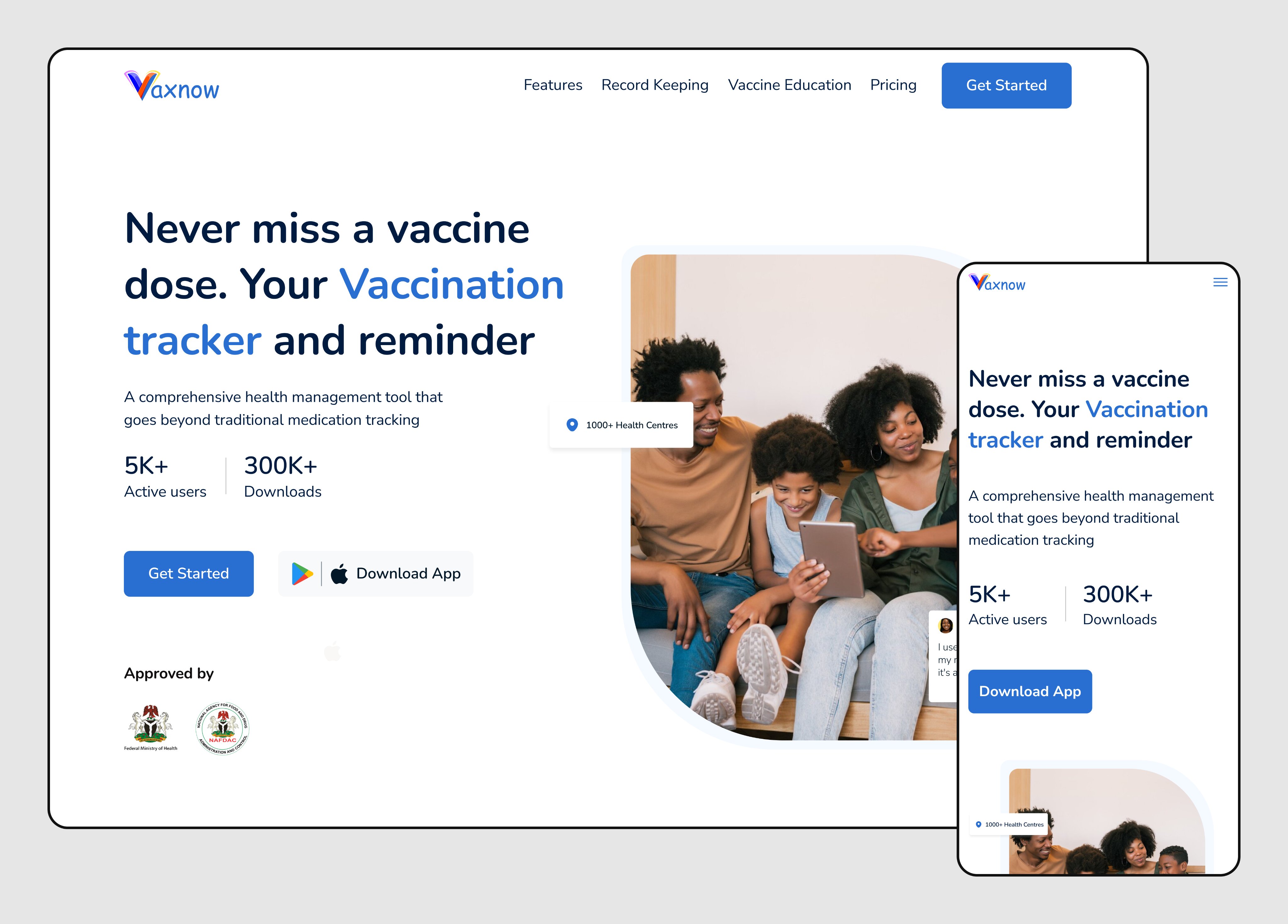
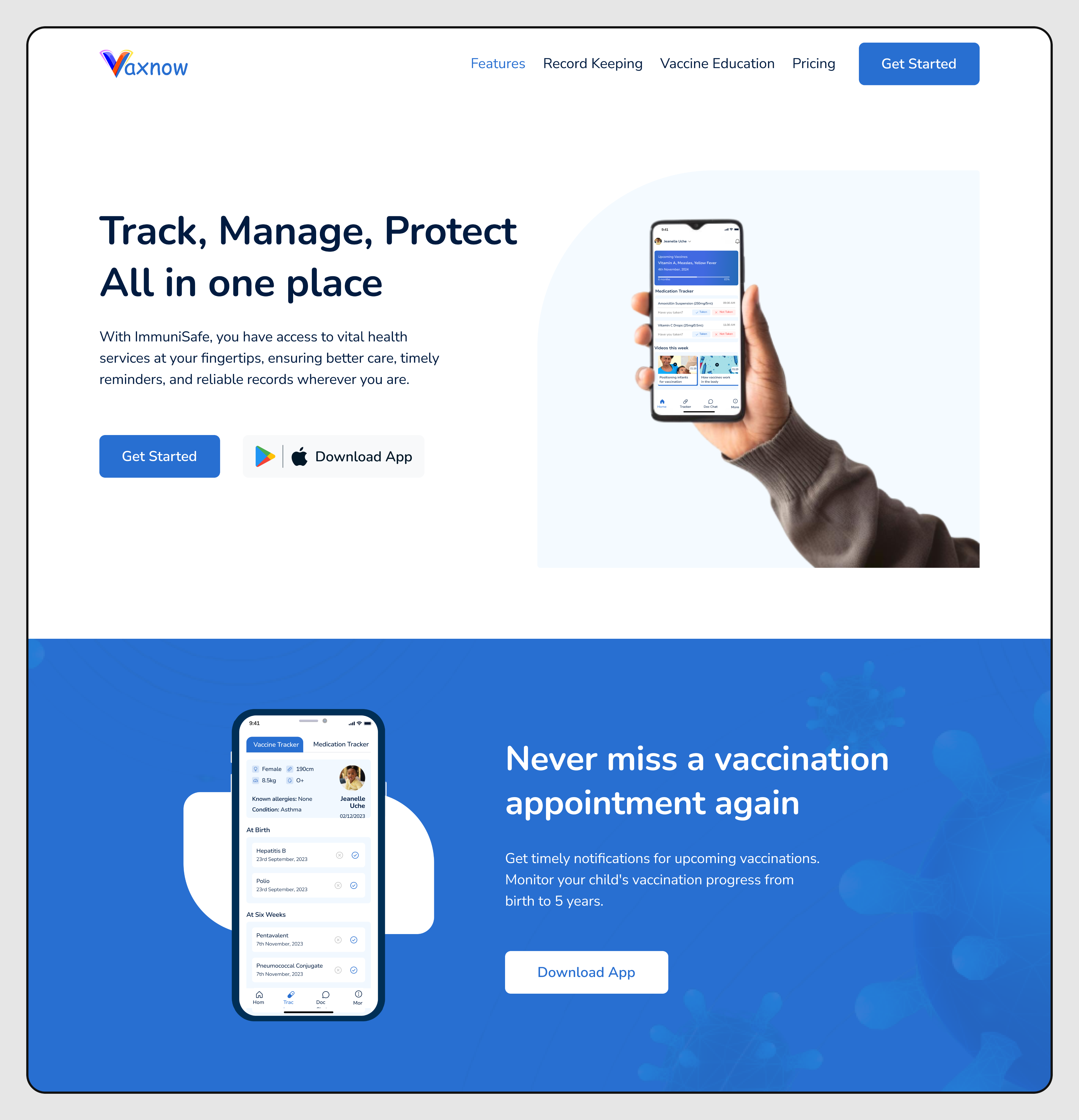
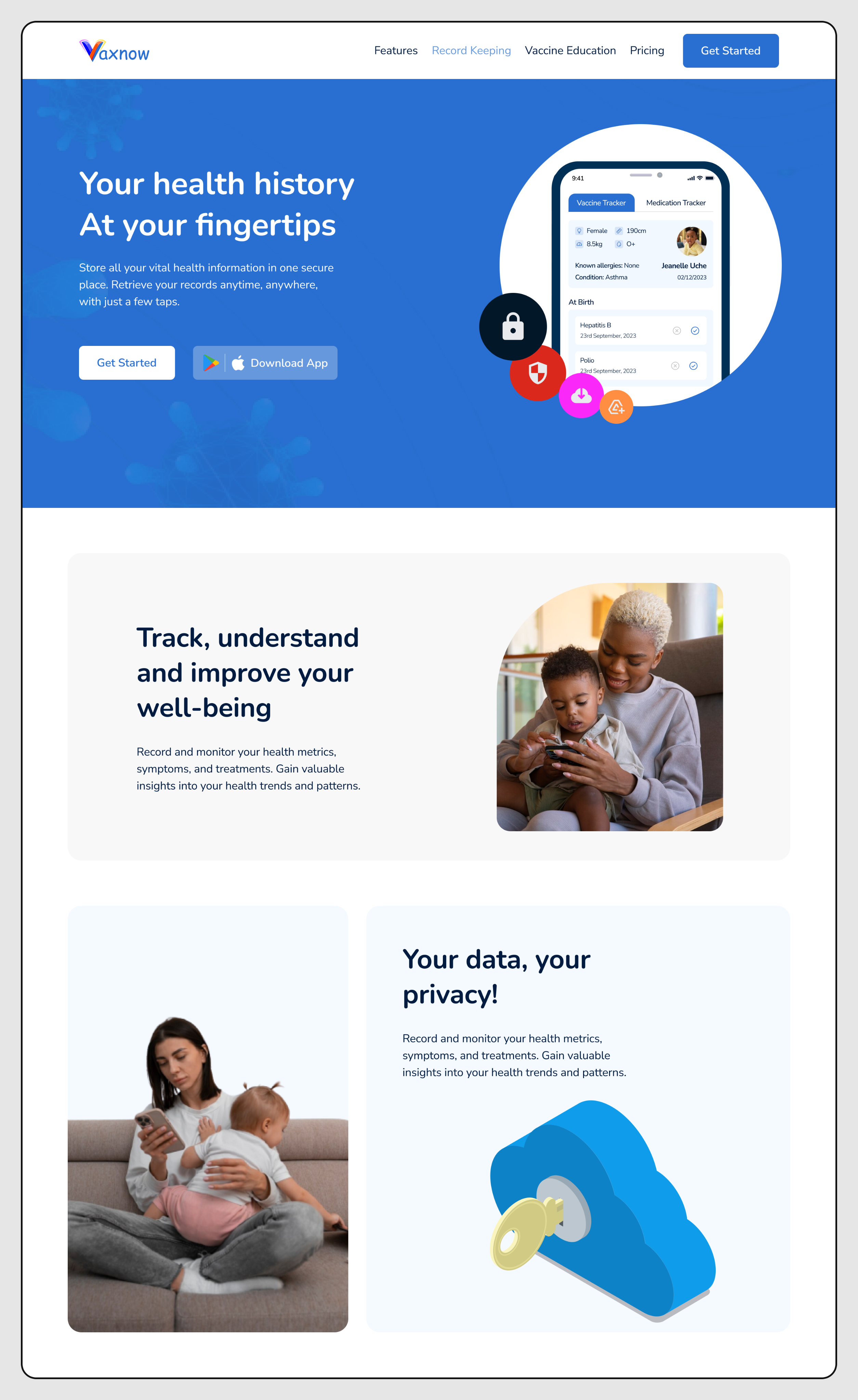
↳ Hero Section
The section contains the headline, subtext, CTA buttons, and a 3D-tilted app mockup. The tilt is handled by Atropos, it attaches mouse event listeners and applies CSS 3D transforms, making the mockup respond to cursor movement. The entire hero content animates in on mount using Framer Motion's initial / animate props with staggered delays on each element. The layout uses a two-column grid on desktop, collapses to a centered single column on mobile.
↳ Features / Why VaxNow Section
A grid of feature cards, icon, heading, and body text. These are data-driven: an array of feature objects maps directly to card components. The scroll-triggered animation uses Framer Motion's whileInView to stagger each card in from below as the user scrolls. This pattern scales well, adding a new feature is one array entry, not a new component.
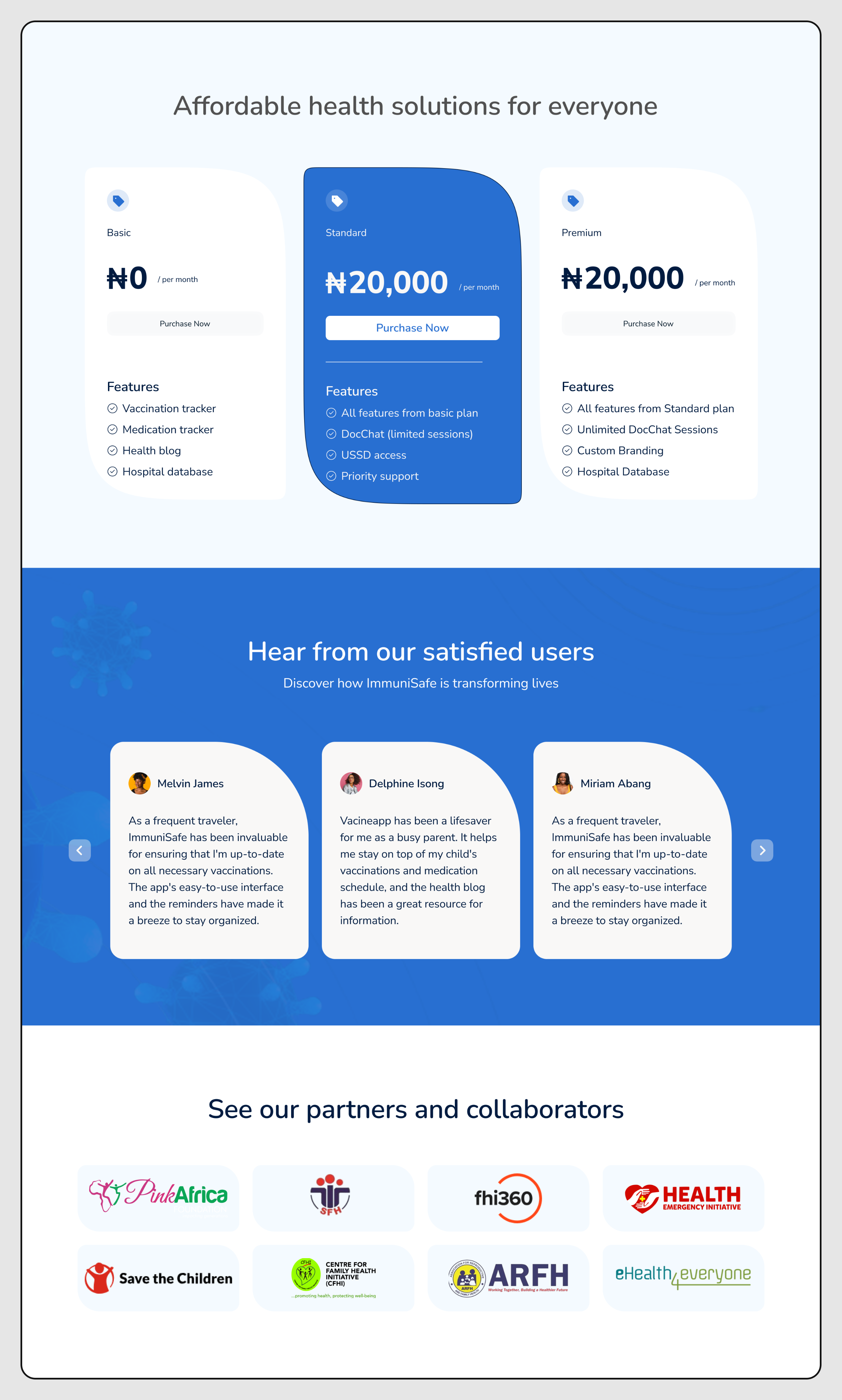
↳ Stats Section
A row of numerical statistics, vaccine coverage rates, user counts, or health impact data. Implemented as a data-driven list rendered with .map(). Numbers are styled with large display typography. The section is deliberately simple, no animation here, because the numbers do the work visually.
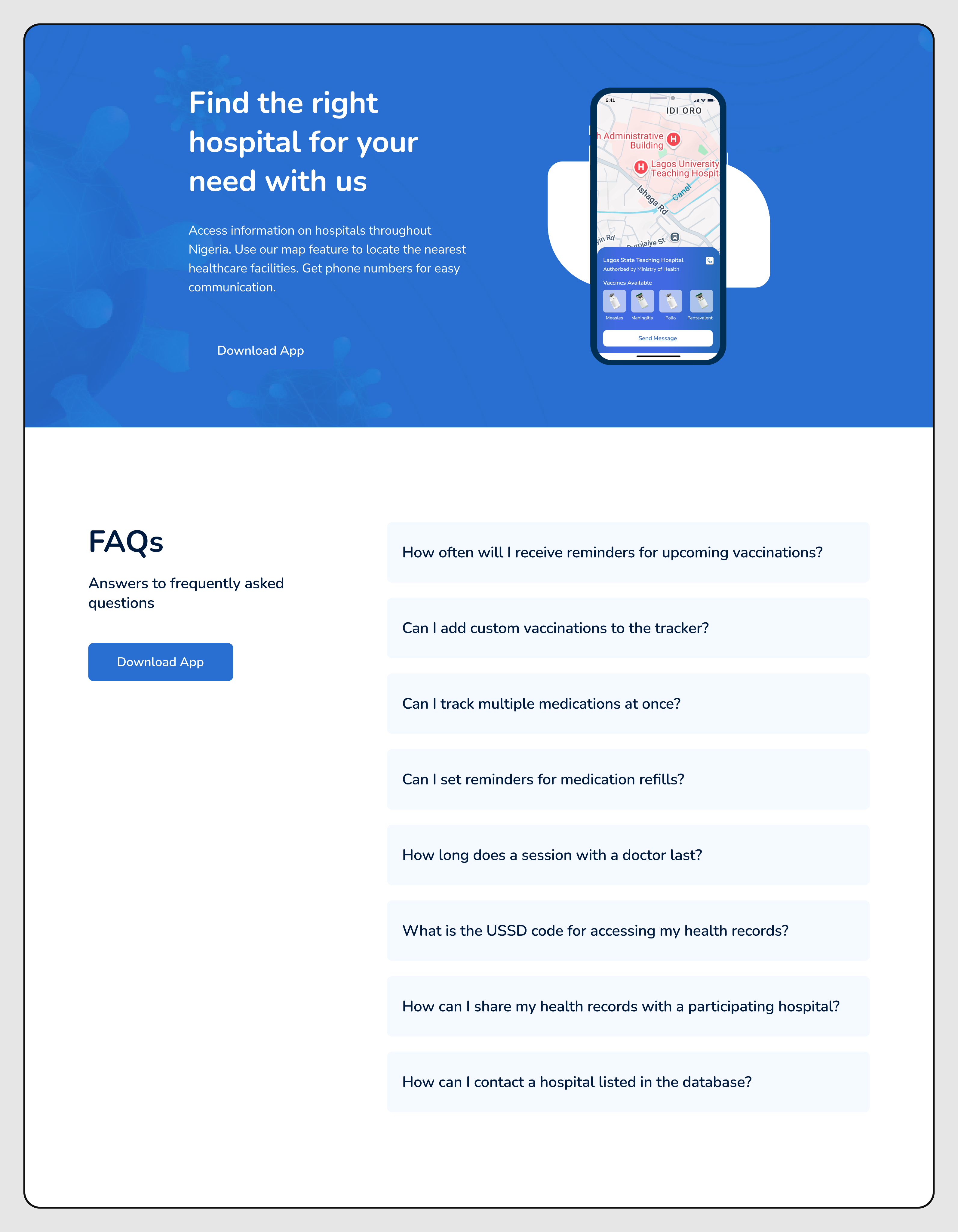
↳ FAQ / Accordion Section
An accordion component with question/answer pairs. State is managed with a local useStatefor the currently open index. Framer Motion's AnimatePresence handles the height animation on expand/collapse, this approach animates to/from unmounted state cleanly without any max-height CSS hacks that tend to produce janky results on variable-length content.
↳ Navigation
A top nav with logo, links, and a mobile hamburger menu. On desktop, links are displayed inline. On mobile, links are hidden behind a slide-in drawer triggered by the menu button. The open/closed state lives in a useState within the Navbar component. A useEffect locks body scroll when the drawer is open, a small detail that prevents the background from scrolling while the menu is active.
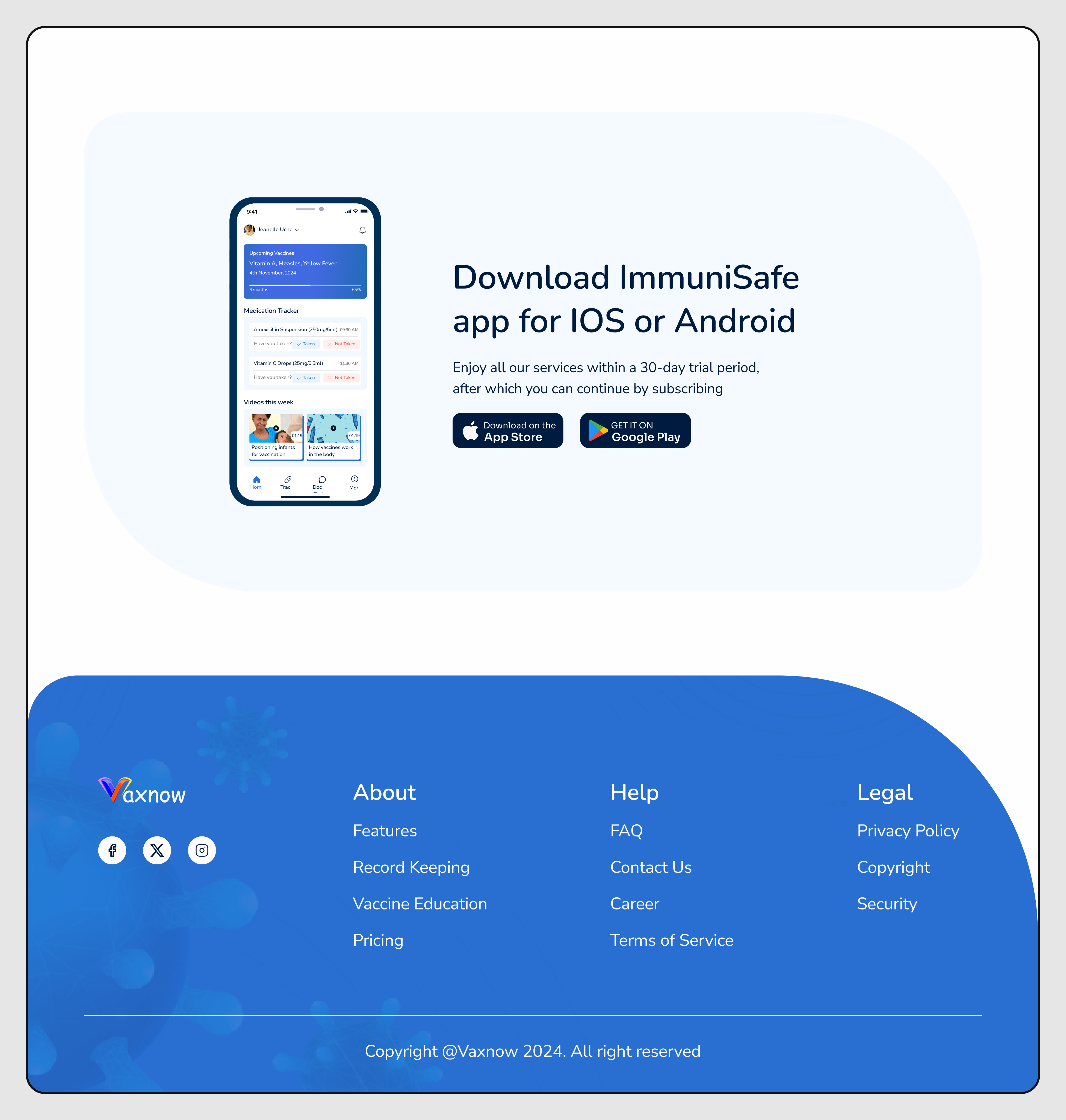
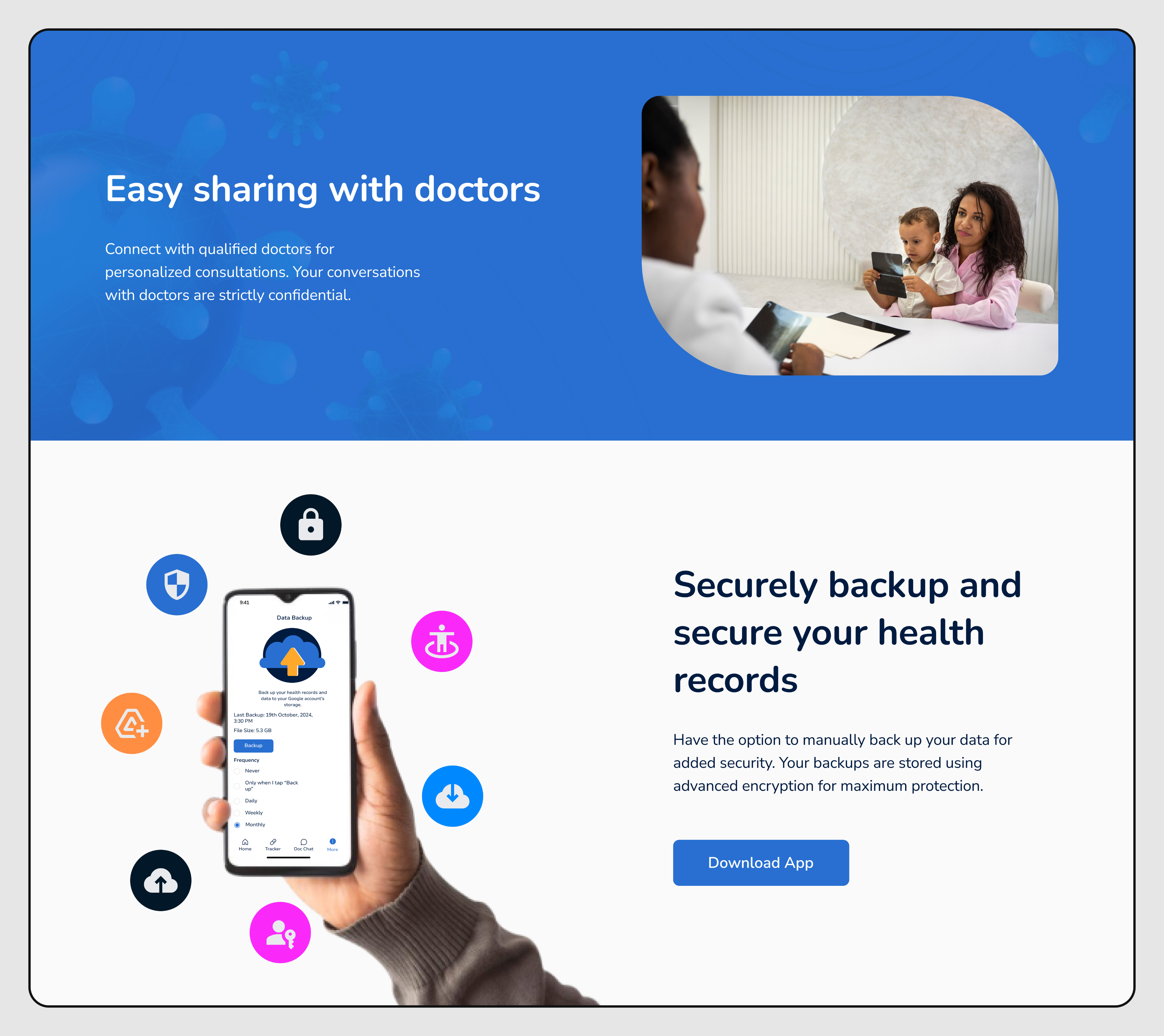
↳ CTA / App Download Section
A full-width conversion section with app store badges linking to the ImmuniSafe mobile app. The implementation is a straightforward layout section, but the positioning is critical, it acts as the page's conversion funnel endpoint, so the visual weight and typography had to be tuned to feel conclusive, not just another section.
Screen Display
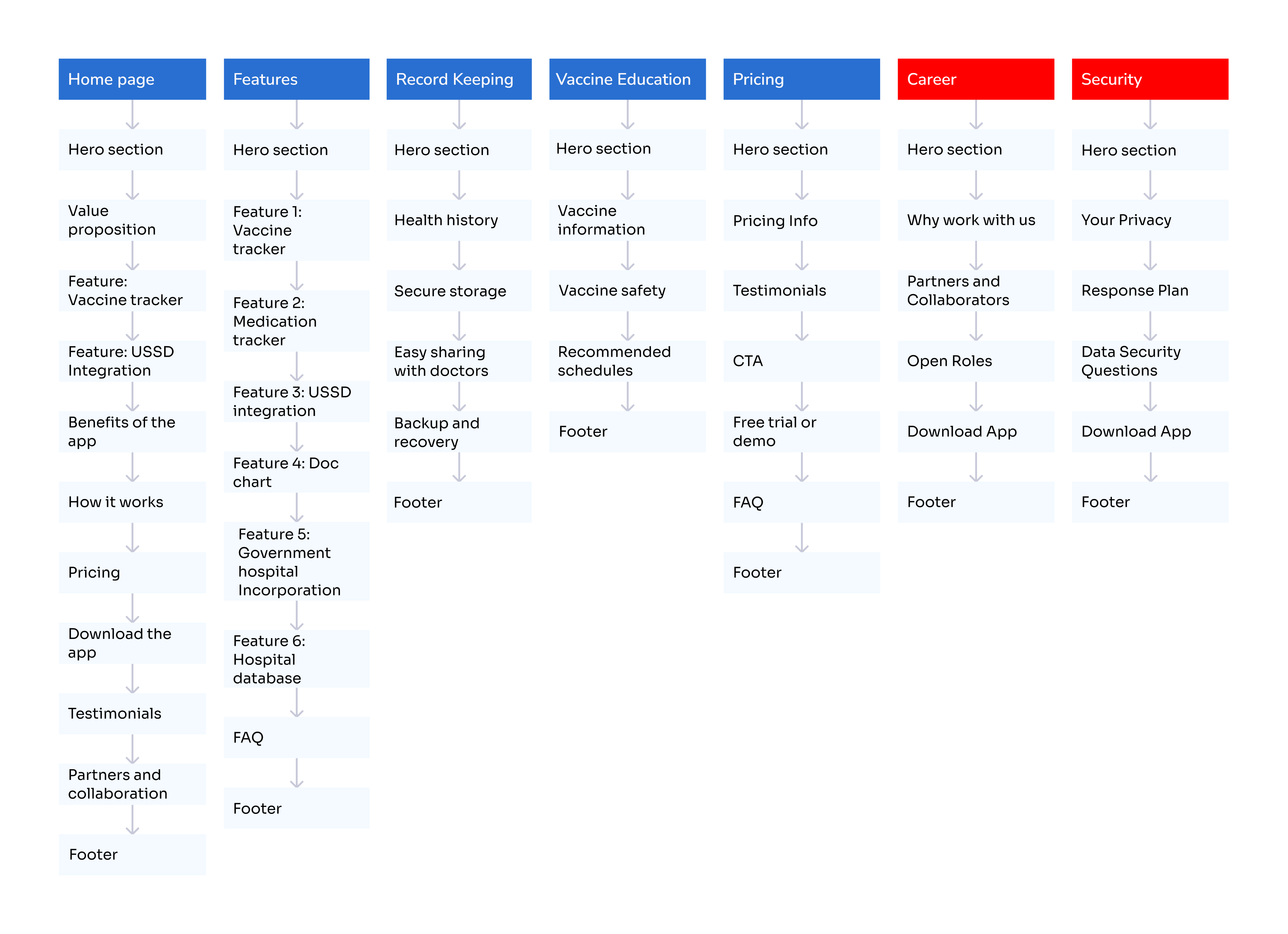
A list of visual representation of the key screens and components of the VaxNow website, showcasing the design and implementation details of selected sections.
↳ Home page
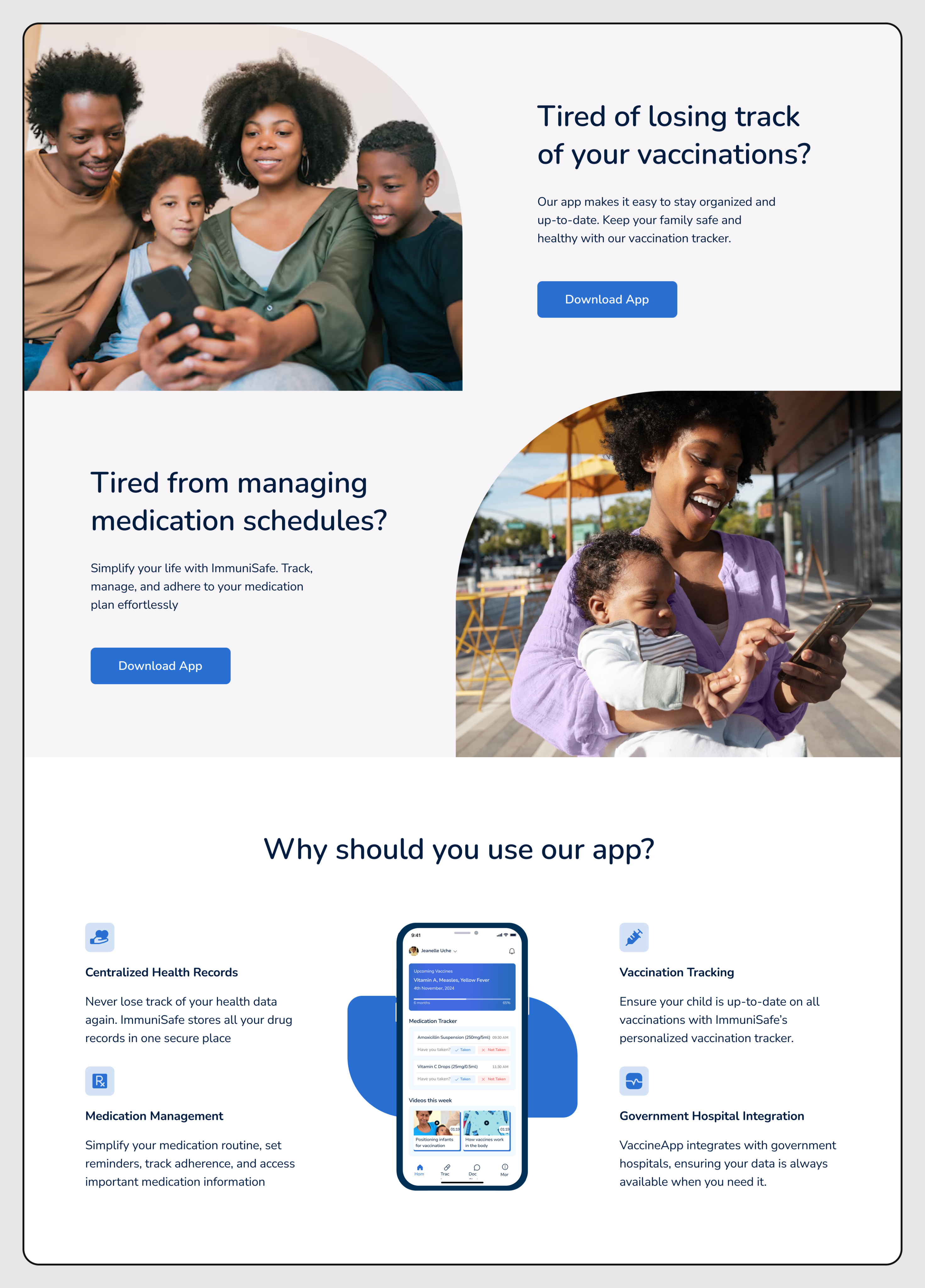
↳ Feature screen Section
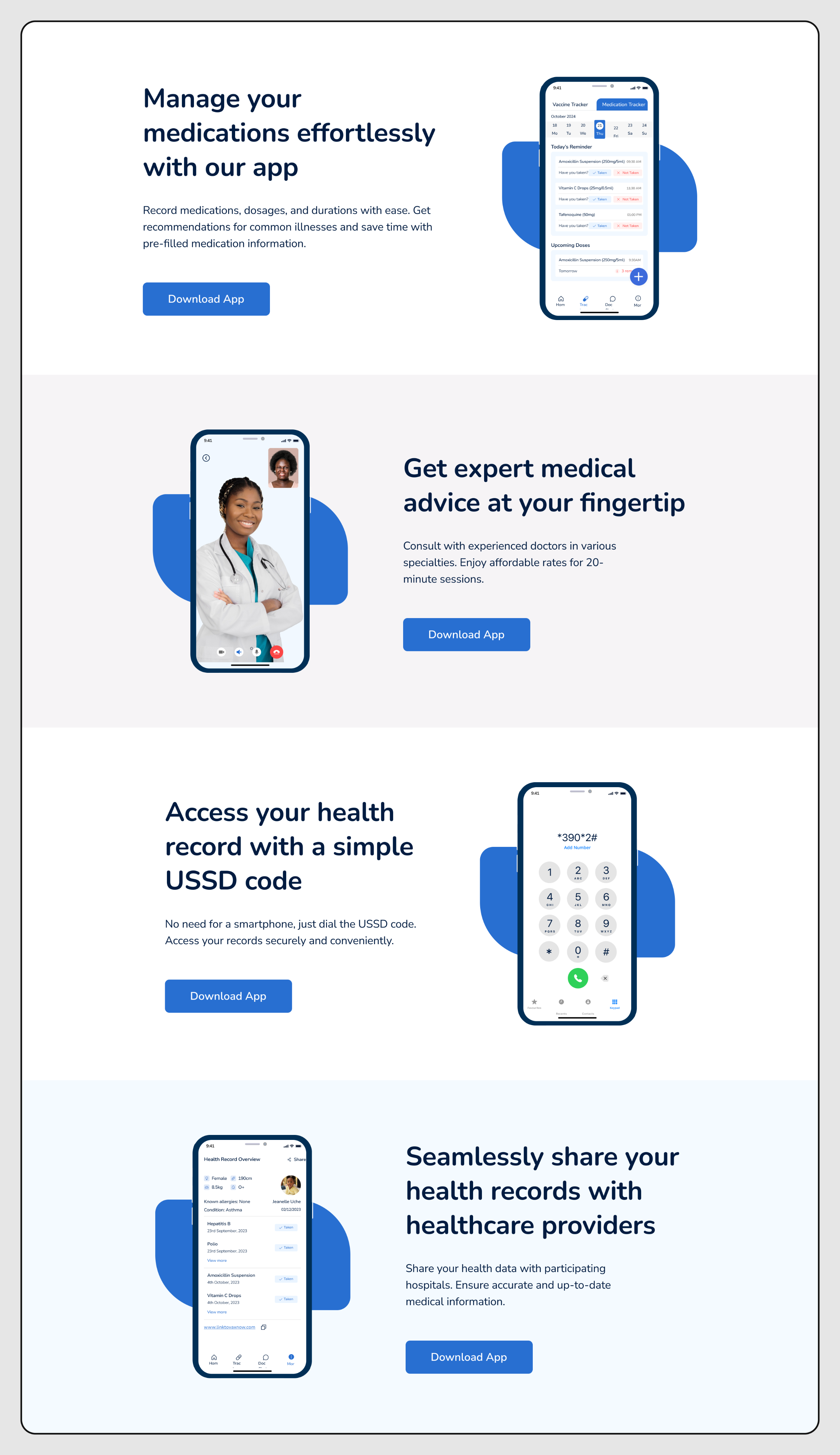
↳ Record Keeping screen Section
↳ Vaccine Education screen Section


Collaboration
The designer handled the Figma side, while I focused on the code. Our main point of connection was Vercel preview links, every meaningful update had a live link I could share for review.
The workflow was pretty straightforward: I’d build a section, send the preview, the designer would check it on their end (sometimes on different screen sizes), then we’d go over what needed adjustment. A lot of the back-and-forth came down to motion details, things like timing, easing, and getting spacing right across breakpoints.
One thing that helped a lot was being clear about tradeoffs. If a design detail was possible but would take extra time or add unnecessary complexity, I’d call it out early and suggest a simpler option that still achieved almost the same result. Most of the time, we went with the simpler approach, which kept things moving without sacrificing quality.
What matters most isn’t the tools, it’s knowing when to pause and clarify a design before coding. It’s a lot easier than reworking a whole section later.
Current State
✓ Shipped
Hero, Features, Stats, FAQ, CTA, Navigation, Footer, all sections built and deployed to Vercel.
◷ In Progress / Planned
Additional content pages (resources, about), further test coverage expansion, accessibility audit and ARIA improvements.
The site is live and functional at vax-now.vercel.app. The codebase has 19 commits and is structured to be handed off or extended by another engineer without a long onboarding period.